Review of my Mac computers, from 2007 to present
- “Aqua”: the user interface of the modern-era Macintosh
- 2007 - Trying Mac OS X on a budget: Hackintosh!
- 2008 - The first Macbook Pro
- 2012 - The White Macbook Unibody - What a “student laptop” should be
- 2014 - MacBook Pro Retina 15’’ - The first Retina experience
- 2017 - MacBook Pro 13’’ - Great connectivity, mid-range power
- 2018 - MacBook 12’’ - The most gorgeous slow computer ever
- 2020/2021 - MacBook Pro 16’’ - The “hybrid car” of Apple Computers
- 2021 - MacBook Air M1 13’’ - The best value in any laptop in recent years
- 2022 - MacBook Pro 14’’ M1 Pro - The return of the Pro
- Footnotes
Here is a little bit of my personal history using Macintosh computers, from a pet project Hackintosh circa 2008 to the current MacBook Pros powered by Apple Silicon.
This is a nostalgia-filled post with a quite a lot of Apple-fanboyism and personal thoughts, so you may want to grab a coffee while I take you with me on this journey. I will also be updating this regularly, so consider it a work-in-progress.
“Aqua”: the user interface of the modern-era Macintosh
When Steve Jobs went on stage in the year 2000 to present the new version of Mac OS, I was a full-time Windows user, probably still on Windows 98 Second Edition. I had no Internet access nor any interest in Apple keynotes! What Jobs presented at the time, however, must have been nothing short of breath-taking for the people in the audience at the 2000 San Francisco Macworld Conference & Expo.
We made the buttons on the screen look so good you’ll want to lick them.
Mac OS 9 was long in the tooth by this time. Apple was in need of a new Operating System with modern features such as preemptive multitasking (essential for the Internet-connected future) and memory protection, which separated the memory accessible to different processes into their own separate segments1. This new OS would, according to Jobs, “be the foundation on which Apple would build and deliver its products in for the next 20 years”. He was right, since Mac OS X was the basis for iPhone OS, which paved the way for the iPhone and consequently, the smartphone revolution that swept the world.
The entirely new user interface of the new Mac OS, called “Aqua”, was completely different than everything Redmond had to offer at the time. Its luminous and transparent elements took advantage of a new graphics system, called ‘Quartz’. Jobs explained how Quartz was actually based on the same PDF technology used to render documents.
2007 - Trying Mac OS X on a budget: Hackintosh!
I made my switch to the Mac around 2008, while I was still an MSc. student of Informatics Engineering. First, I started by trying to convert my back-then desktop computer into a Hackintosh running 10.5 Leopard. Looking back, it was a terrible choice of hardware, since only Intel could run reliably back then. This ended up playing in my favor in the long term, since I had to start getting acquainted with command line tools and the Unix-way of doing things. At the time it meant working with the Terminal, editing and writing BASh Scripts and understanding .plist files.
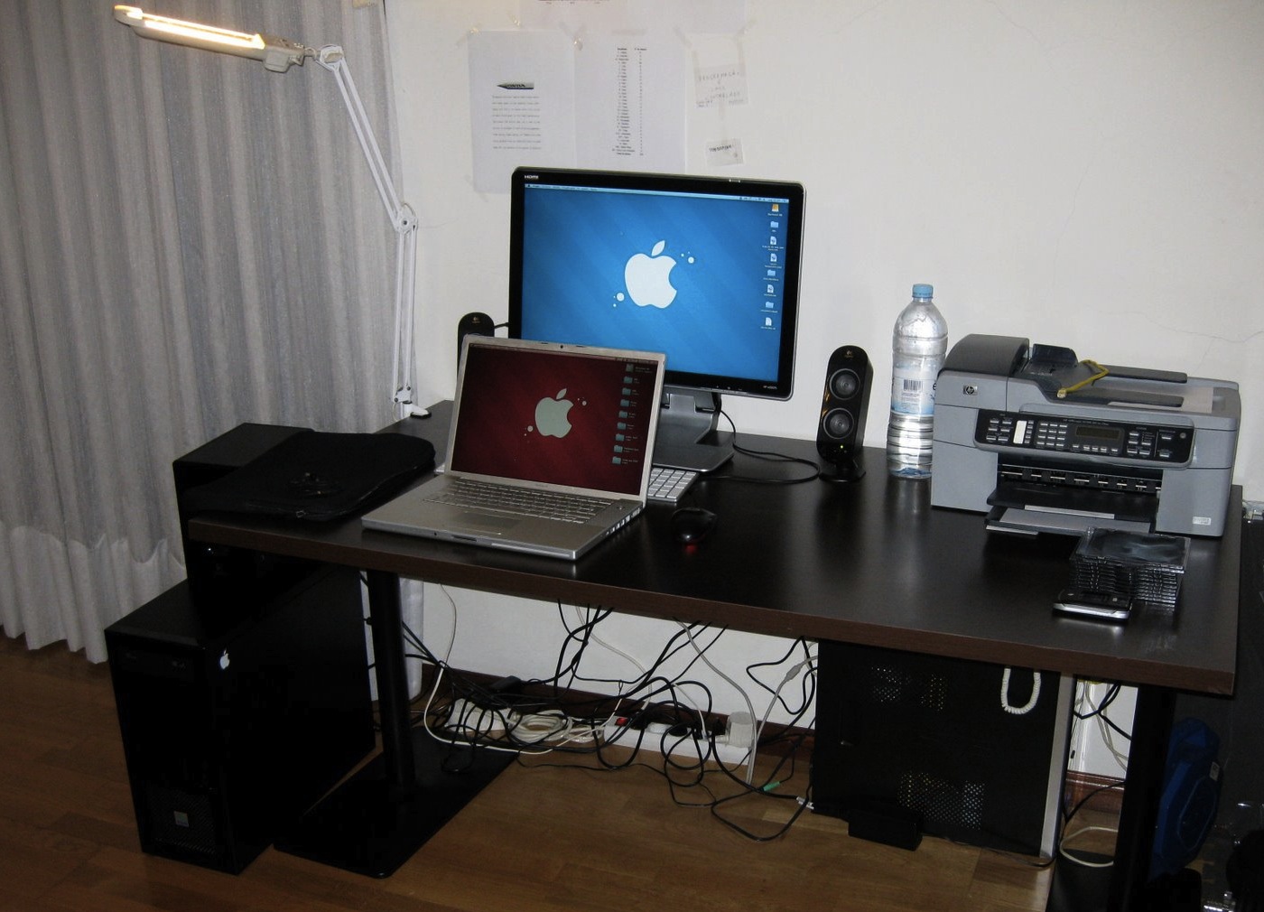
Home setup, circa 2009. At the bottom left, my first Hackintosh running on an AMD64 3000+ CPU. Under the table below the printer, a Linux server cobbled together from old parts.
Kernel panics were frequent, but it was all worth it when it finally booted up. The shadows looked amazing, and using Adium, the native Mac cross-platform messaging app for the first time is an experience that I will not forget. I had no money to buy a real Mac, but now I was sure that I wanted my own Mac laptop, even if that meant giving up on playing games in exchange for a superior work machine.
2008 - The first Macbook Pro
By the end of 2008 my parents gifted me my first Mac laptop. It was being sold at a great discount, around the time when the Unibody ones started coming in. It was an Early 2008 MacBook Pro A1260 model that came with 10.5 Leopard, and I absolutely loved it. By this time, Windows XP was the most widely used OS. A glowing Apple logo on the back of a computer lid was a rare sight in Portuguese university classrooms—at least outside of a Fine Arts class, where Macs where greatly praised for their tight integration with the Adobe creative suite. The screen on that MacBook Pro was colourful, vibrant and high-resolution (1400x900), resulting in an better viewing experience than on my previous Windows computer, a Sony Vaio FE12M, which had excellent color and brightness levels for the time but capped out at 1280x800.
By that time, most students like myself were using Windows XP as their main OS (after all, we were students and needed to play games) and Linux was the OS of choice for those subjects where UNIX was required. On PCs of the time it was common to have to dim the screen to the minimum and cut down CPU clock using RMClock if you wanted it to last throughout a 2 hour class.
The battery life of the Mac was worlds apart. It would get 4 hours in class with 25% brightness, so I could actually see what I was typing. The Mac also gave me a window into a UNIX-based system that I could actually daily drive, because GUI apps worked great, and BASh scripting was readily available out of the box.

That’s me working on my MSc. dissertation, circa 2009.
Notice the A1260 MacBook Pro and the Motorola V3X on the table
I hold dear memories of using that computer, since it was my main work tool throughout an MSc. dissertation, starting a YouTube channel, and the early stages of what ended up becoming my Ph.D. thesis. Omnigraffle Pro 5 was awesome to design UML Class diagrams in! Unlike Microsoft Visio on Windows or Dia on Linux, it had nice and smooth shadows, anti-aliased fonts and overall better look. Like in a restaurant, the eyes also eat, right?
The OS was truly fun to use, even more so than Windows XP. The subtle, pulsing glow of the default button in a modal window in Snow Leopard…Just like Steve Jobs did, I love the skeuomorphic design from those days! And while some may consider Windows XP childish with its plasticky buttons and title bars, I also continue to enjoy its contrasty intuitive colors back then.
In his speech Commencement address at Stanford University on June 2005, Steve Jobs talked about how he decided to take a calligraphy class at Reed University when he was in colleged. This came to impact the Macintosh user interface, which according to Jobs, was “the first computer with beautiful typography”. This attention to detail spans across decades of Apple products, where beautiful and clear fonts were chosen for every part of the UI. Take for example the Chicago font, used in the Macintosh from 1984 and 1997 and later slightly modified for the iPod as well. This was famously named after one of Steve Jobs’ favourite cities

The Chicago font used in old iPods and Mac OS versions
On the Mac, the subtle animations when a window was minimised and maximised were not only technically impressive for the time, but elegant at the same time. More than providing useless flourish (looking at you, Compiz), they served a purpose and helped the user understand where the window went.
The modal dialogs that popped up when you needed to save a document or answer a prompt kept the user in focus and provided useful hints and shortcuts. The ⌘D shortcut to always select the Desktop as the target destination saved me more time than I can remember throughout my life time as well!
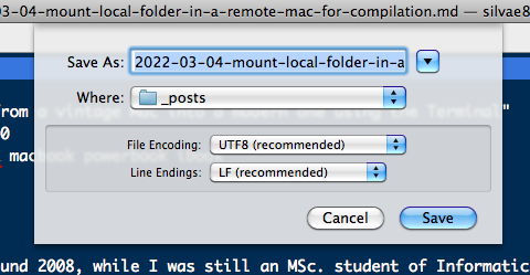
Some lickable buttons: modal folder picker in Mac OS X 10.6.
All in all, I had no idea how spoiled I was during this era of skeuomorphism. Since Yosemite (10.10) every button, scroll bar and top left semaphore in the macOS UI is flat and streamlined, in the name of reducing visual clutter and maintaining a sleek image. It exchanged some of its fun for sharpness and professionalism and became somewhat more serious.
2012 - The White Macbook Unibody - What a “student laptop” should be
Like many of its kind, my 2008 Macbook Pro died a painful death when its GPU, the flawed nVidia 8600GT, finally gave up on me around 2012.
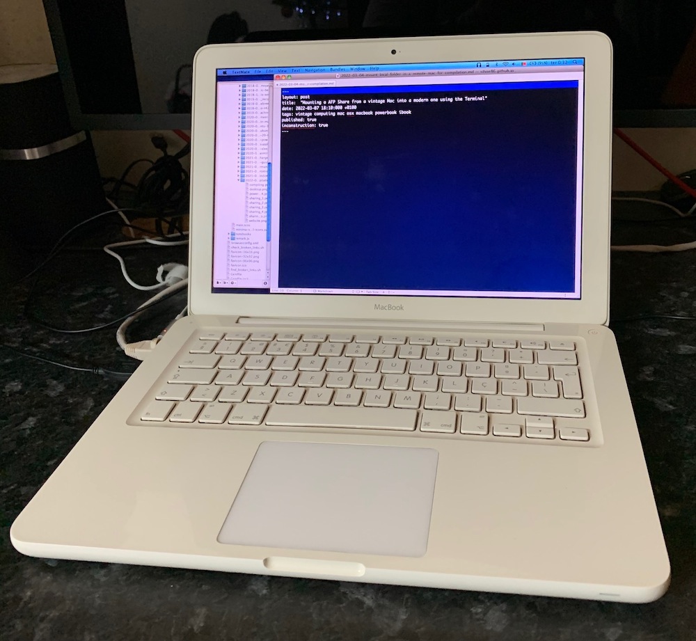
2010 Unibody Macbook White (plastic).
Meet my 2010 MacBook Unibody White with an Intel 2.4 GHz Core 2 Duo processor, bought after my 2008 MacBook died. It was a beaten up machine that I got second hand for the reasonable price of € 450 at the time. At such a low price for the time, it had some problems that I figured I could fix with my trusty precision screwdriver set, some thermal paste and a few new parts…
It came with a 1000-plus cycle count battery, whose internal resistance made the laptop hot to work on and short-lasting. It was missing a couple of keys in the keyboard and was powered by an aftermarket ‘El Cheapo’ power adapter lighter than most of today’s mobile phones. I still remember how the charger’s terrible grounding would give me shocks in the ears when I was wearing earbuds… but hey, when you are a Ph.D. student money is always short and you can’t be picky. I proceeded to repair and upgrade it as much as I could, with a new aftermarket battery (still delivers up to 4 hours of light use to this day), a 250 GB Samsung 840 SSD, 8GB RAM, and the missing keyboard keys.
Perhaps the most recognizable characteristic of this laptop is its polycarbonate plastic construction that hides scratches very well, an essential feature for laptops that are intended for classrooms and dorm rooms. Another awesome aspect about this laptop is that you can run many versions of Mac OS X, from Snow Leopard (10.6) up to Catalina (10.15) through the unofficial patcher by dosdude1.
2014 - MacBook Pro Retina 15’’ - The first Retina experience
The first Retina MacBook Pro I ever used came out of the box with Mac OS X 10.9 (Mavericks). Up to that time, on the most widely used Operating Systems, one physical pixel was always used to render a single logical pixel in an UI (1:1 scaling). On a Retina display, 4 physical pixels are used to render the same logical pixel, causing the interface to be scaled to fill in the extra pixels. This HiDPI mode, coined by Apple as Retina, allows for much crisper images and typography everywhere, almost resembling printed text and photographs.
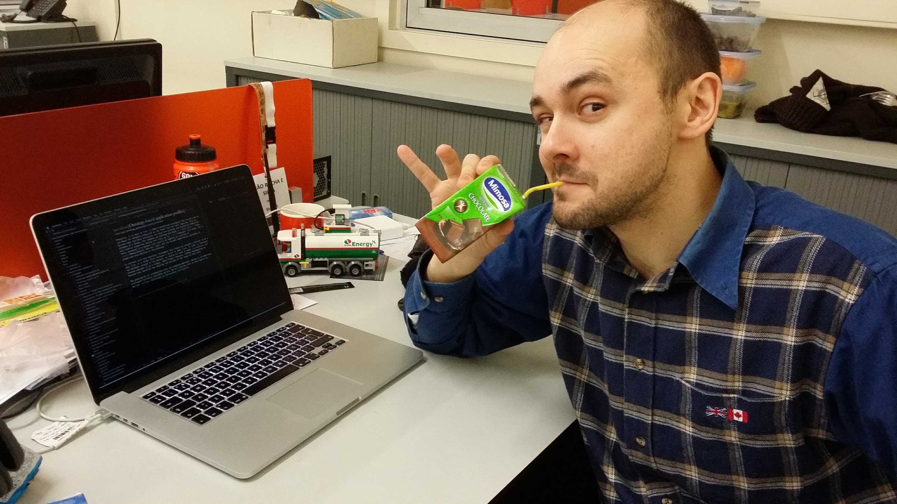
That's me in a late night around 2015 working on my Ph.D. thesis
As always, it was Apple’s execution of this new high pixel density UI all throughout the OS X that made the difference. When Mavericks came out, the UI was beautifully remapped to a high-pixel version, with pixellated elements being few and far in between. Developers were also quick to update their apps’ assets to provide the Retina display experience.
HiDPI mode came to Windows as well, with many of the Windows native scaling gracefully. However, many older apps and less user-facing areas of the OS looked bad back then, since they never got an overhaul like that done upon the release of OS X Mavericks. Even to this day on Windows 10 you will sometimes get apps with tiny buttons and fonts because the scaling is not working properly. Fortunately this is rare and far in between.
This laptop was my research workhorse in my last years as a Ph.D. student. My particular one was the base i7 at 2.0 GHz, without a dedicated graphics card. The main reason was that I was afraid of GPU defects after my 2008 MacBook Pro died because of a bad GPU, and the price was much lower. The Intel Iris Pro is a very capable graphics card for most everyday uses outside of gaming and any sort of 3D modelling. Even video rendering was quite fast in Final Cut Pro X.
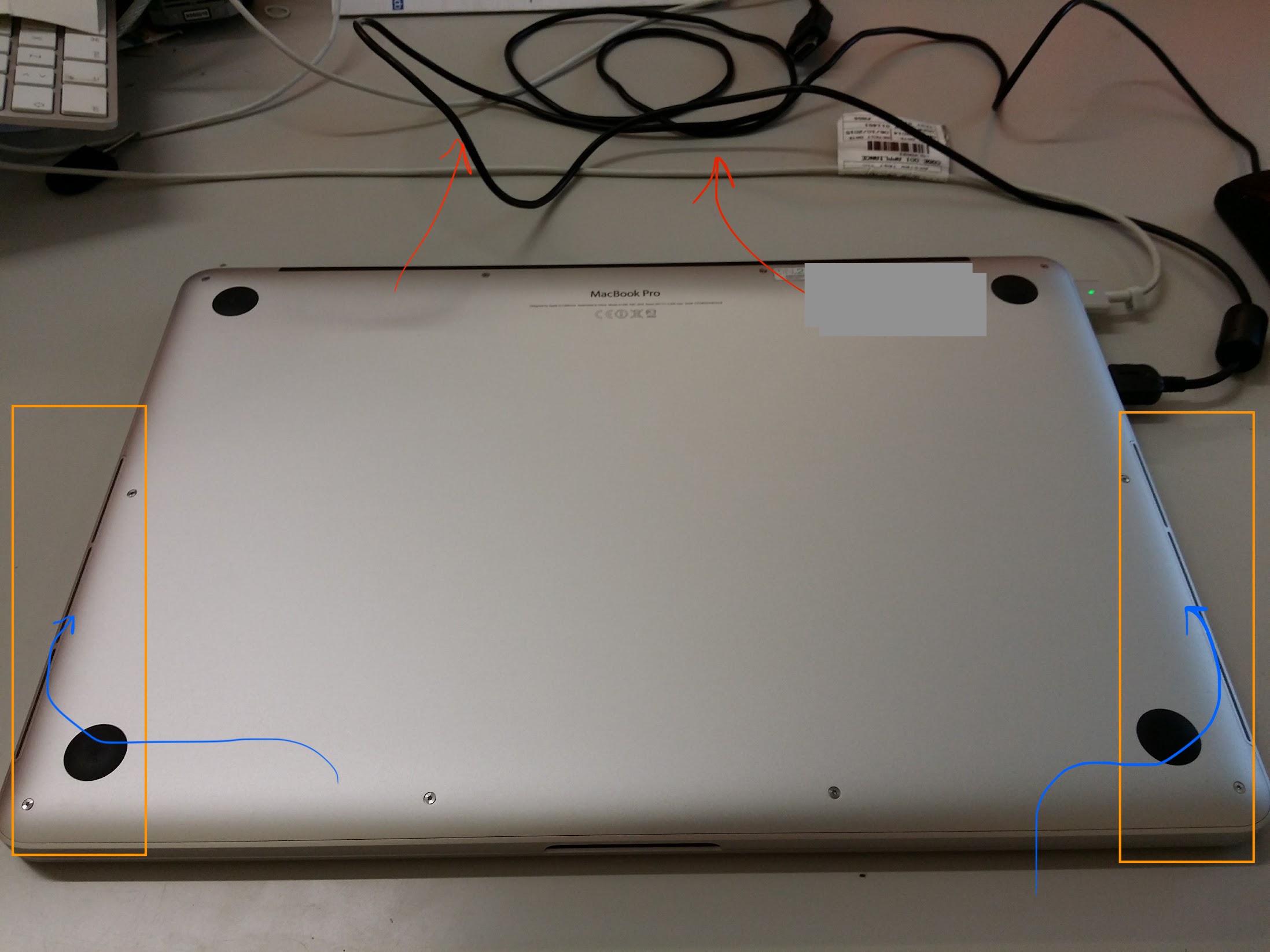
The airflow path in the 2013 Retina MacBook Pro's under case
The computer was solidly built, with a long battery life, the best screen I had ever seen in a laptop, a very crisp keyboard. Apple had also learned from their overheating mistakes of the past and provided the laptop with a couple of very slim air intake notches at the left and right edges of the bottom case.
This greatly improved airflow inside the case and ensured a quieter working environment. You would really notice the cool air flowing towards the inside of the machine when under load and the fans spun up. No wonder the MacBook Pros from 2010-2012 had the habit of overheating and dying… No cool air intake at all!
2017 - MacBook Pro 13’’ - Great connectivity, mid-range power
By 2017 I had to update my personal laptop with a more recent machine, as my Unibody Macbook White from 2010 was starting to show its age. The 15’’ MacBook Pro was my lab-supplied machine and was simply too large to lug around everywhere. Looking for a personal machine that I was going to buy with my own money, I started looking around on second hand market.
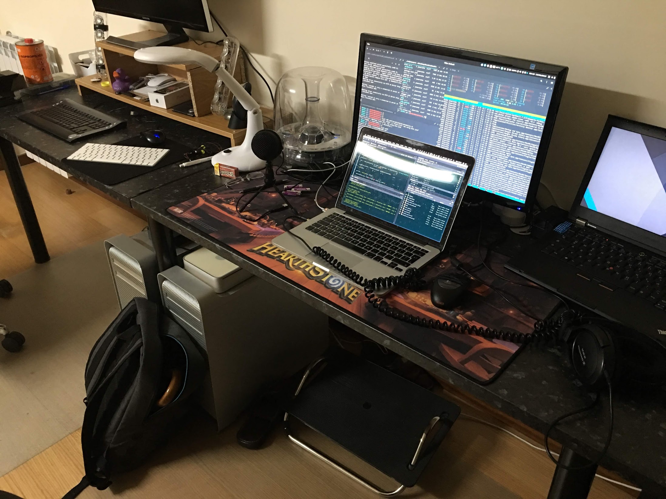
MacBook Pro 13-inch, mostly an SSH client for all those machines by this point. Notice the 2 sexy Mac Pro cheese graters under the table.
I ended up buying a second hand Early 2014 13’’ Retina MacBook Pro, with a dual-core i7 at 3.0GHz, with 16GB of RAM, for 750€. The most powerful and rare configuration, the computer had some issues: very worn out keys, a MagSafe charger with a torn cable, a battery on its last legs, and a bad case of the Retina Macbook Pro delamination issue in the display. When I bought it, I proceeded to replace the thermal paste, the battery and clean up the remains of the bad anti-reflective coating with some eyeglasses cleaning solution, a microfiber cloth, and a lot of patience.
2018 - MacBook 12’’ - The most gorgeous slow computer ever
For a long time, I also carried heavy machines, like the Lenovo ThinkPad W520. By that time, I used to joke about how a laptop tells a lot about someone’s job when you look around a meeting table: if it is a very slim and portable machine, you can hazard that this person is in a management position. If it is a thick brick of a computer, this person may be an architect, a professional video/photo editor, a video game developer or a programmer who also needs his daily gaming fixes. If it is somewhere in the middle, like a 15’’ MacBook Pro, then you may likely be in the presence of a Web developer who clearly does not game.
Transitioning to a 12’’ laptop was my failed attempt to distance myself from development work and transition into more managerial role, if you will. Research is a lot about getting money to fund your next 5 years, so I had to focus on writing project proposals as a Post-doctoral researcher and leave coding to the grunts. In the end, I just could not live without coding and felt my future would not be in an academic career, so I joined the private sector as a Software Engineer.
In 2018 I bought a Gold 12’’ MacBook, looking for a very light laptop that would always be with me in case I needed to write something down or reply to an email quickly while on the road. I have to say, at the beginning my main motivation for choosing this color was the price! This machine was on clearance sale, and all the space gray units had been sold.
Overall, this machine was for those willing to compromise. A single USB-C port means you have to be willing to go fully Bluetooth on your peripherals. Weak Core-M/Netbook class CPUs mean that you will have to offload all your heavy computing to the cloud or to a remote machine somewhere. A 480p webcam with terrible low light performance. A time-bomb of a keyboard that forces your tables to be absolutely spotless, as a single crumb under a key can permanently make your keyboard unusable … BUT! in exchange for all that hassle, you have a computer thinner, lighter and more beautiful than anything else on the market at the time (and dare I say, up to this day). I see it very much like an 1969 Alfa Romeo GT Junior2: an emotional purchase that may give you a lot of headaches most of the time, but when in the right context, makes up for everything and makes you smile.
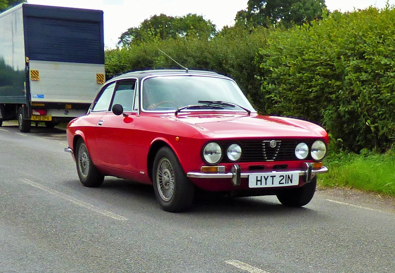
The MacBook 12'' is the 1969 Alfa Romeo GT Junior of laptops.
These machines were notorious for their fragile keyboards based on a new “butterfly mechanism” which replaced the “scissors switch” ones that came before it. This new mechanism was necessary for Apple to build even thinner laptops by reducing the space necessary for the keys to travel. However, such a small gap in the key mechanism made it very susceptible to crumbs and dust, which when stuck inside the key would be almost impossible to flush out, causing dead or stuck keys. Apple released a guide covering how to clean these keyboards, and more importantly, a 4-year warranty extension on the keyboard only counting from the date of purchase. This 4-year warranty gave me the peace of mind that I needed to buy the computer at the time, so it was not entirely emotional for me.
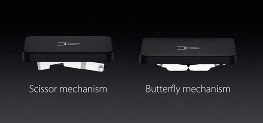
Scissor Vs Butterfly Keyboard Mechanism by Apple
The MacBook 12’’, with all its quirks, slow performance and single-USB-C-port personality, was a very pleasant computer to use. I wrote long essays and papers in that keyboard, which was clicky and responsive (mine was the 2017 version, slightly improved over the more mushy 2015 version). The screen was gorgeous, there was no distracting fan noise, battery life was far from prodigious but still acceptable. The speakers sounded impossibly good for a computer of that weight and size.
I would buy one again, for the fond memories I keep. However, since they have to be bought new because you don’t know what crumbs may be hiding under those keys, I guess that ship has sailed. However, if hope Apple decides to bring it back with a Magic Keyboard and brand new Apple Silicon under the hood… I will seriously consider it.
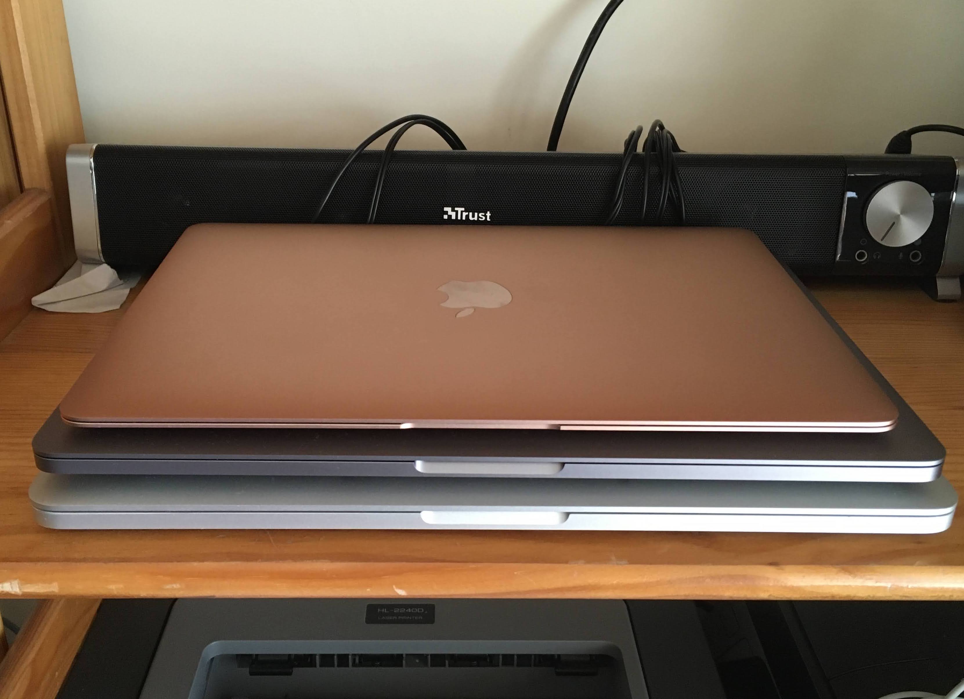
From bottom to top: 2013 15'' Macbook Pro, 2021 M1 MacBook Pro, 2017 12'' Macbook
2020/2021 - MacBook Pro 16’’ - The “hybrid car” of Apple Computers
This one left me with mixed feelings. You spend years enjoying and praising Macs for their stability, and all of a sudden… you are disappointed. I used 2 distinct machines of this type, and faced issues like freezing/lagging Touch Bars or frequent crashes / Kernel panics3 when connecting/disconnecting the LG Ultrafine 5k display.
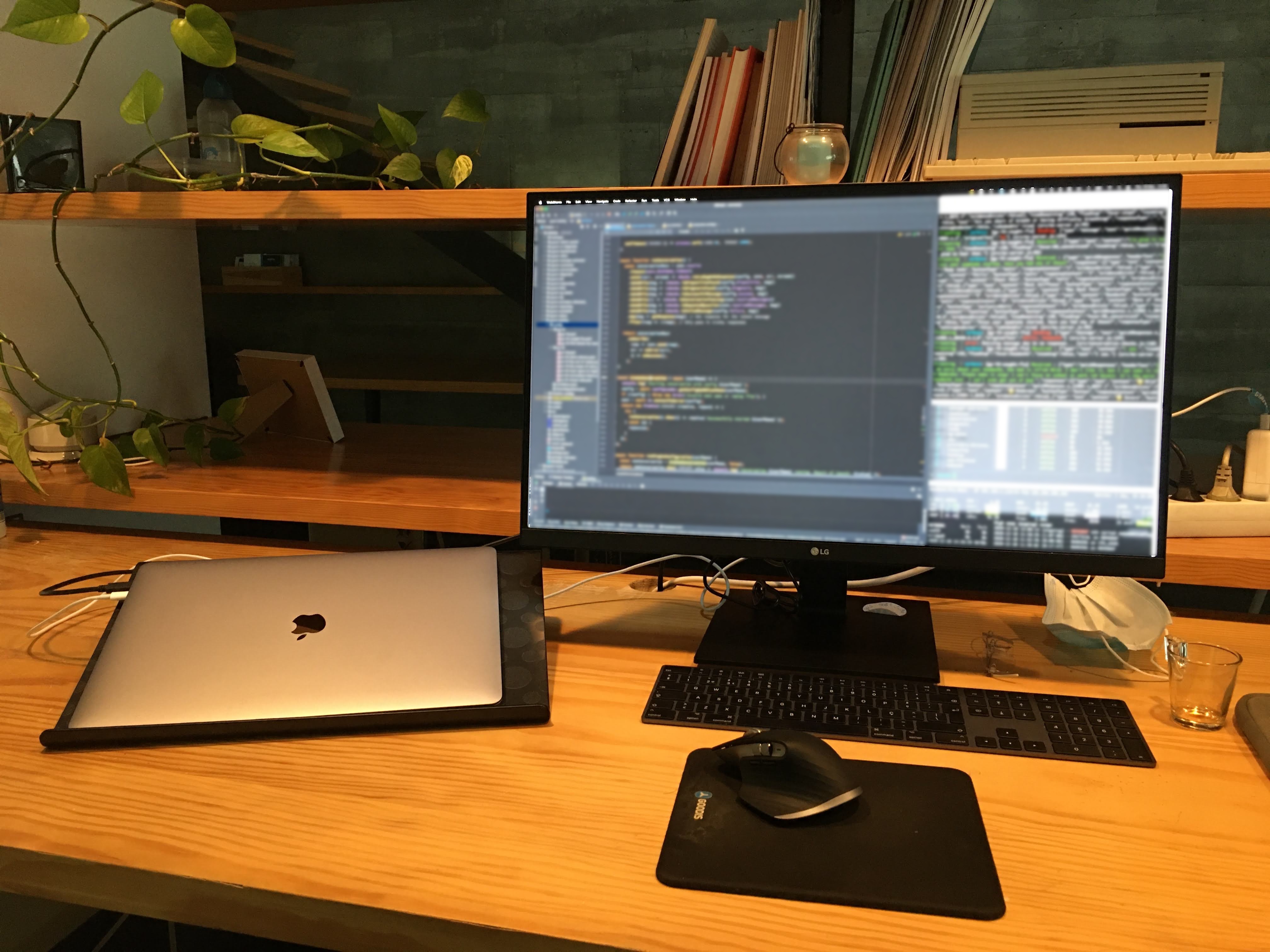
MacBook Pro 16'', Apple Magic Keyboard in Space Gray and Logitech MX Master 3. In the background you would constantly hear the fans blasting.
This laptop felt like a product of Intel’s failures in delivering a proper 10nm CPU in time for the new MacBook Pro enclosure. It looked like Apple was promised cooler and faster CPUs by Intel way before they launched the Touch Bar MacBook Pros in 2016, Apple designed a super-slim laptop under those assumptions, and then Intel did not deliver. The result? A super hot chip inside a very thin laptop, with noise, overheating and crashes galore.
A hybrid car, you say?
In a hybrid car we have to combine the new electric infrastructure, full of revolutionary technologies, but still hampered by insufficient battery specific capacity and range, with the older but mature technology of the internal combustion engine. The hybrid approach is only necessary until the electric matures and can stand on its own. You have some advantages but also all the drawbacks of both: a heavy and limited-lifespan car because of having to lug around heavy batteries, redundant systems which can add points of failure… but you go with it because you have no other option.
As a side note, this makes me remember how much I admire Toyota and the Prius. You may not like the car, but Toyota managed to make it robust and reliable, despite all the different ways it could go wrong. And they stood behind their product, which is more than we can say of Apple, who never admits they are wrong… at least until the pressure of class-action lawsuit is too great.
Why do I call this laptop a hybrid car? Because hybrid cars are nice, but only stopgap solutions, much like the 16’’ MacBook Pro. The 16’’ showed how Apple already knew how complacent Intel was by this time, how their foundries were having problems with the new 10nm process, and thus would not deliver on their roadmaps. Intel had accelerated Apple’s switch to ARM, since much like in the days of the IBM PowerPC, Apple had no way to build the products that they wanted with the CPU roadmap proposed by Intel. The T2 chip inside the 16’’ MacBook Pro already showed more and more responsibilities being handled by Apple’s silicon (video encoding, disk encryption/decryption, secure enclave, etc). The seeds of the transition were already there.
[…] as we look ahead we can of envision some amazing products we want to build for you and we don’t know how to build them with the future PowerPC road map4.
From my experience as a developer, the 16’’ MacBook Pro was heavy, blistering hot, noisy all day, buggy, and as a consequence had terrible battery life during productive activity. The Touch Bar never actually made sense to me as someone who uses the F-row for debugging shortcuts on a daily basis… but hey, at least we got a keyboard that did not die when a breadcrumb gets stuck under a key!
One cable on each side
On the 16’’ MacBook Pro there was is a quirk for those lucky few that own a couple of LG’s 5k Ultrafine monitors. When you plug in a display with a resolution larger than 4k (like the LG Ultrafine 5k) into one of the Thunderbolt ports, you could not drive another display larger than 4k via the Thunderbolt port on the same side of the laptop. Instead, you had to connect the second display to one of the ports on the opposite side5.
This meant that when running a dual 5k monitor setup, you had to either have the laptop in front of you when in clamshell position with one cable out each side of it, or have cables hanging out the sides of your desk.
2021 - MacBook Air M1 13’’ - The best value in any laptop in recent years
With the launch of the ARM-based laptop processors, Apple really shook the market. With the new M1 series of processors, we now could have long battery life, performance that beats the 2013 Mac Pro… and no fan. NO FAN! Let that sink in. The key to this great success was bringing the expertise acquired throughout the many years of development of iPhone mobile processors.
“Look ma, no fan!”
For the first time in a MacBook Air, the design is fanless, but that does not mean any less performance. This 13’’ MacBook Air (with a 10W TDP and 30W charger6) compiles this blog in 6 seconds, while a watercooled 10-core Intel Core i9 7900x Hackintosh with a TDP of 140W7, takes over 10 seconds. Hardly any scientific evidence, but matches Apple’s claims of much superior performance per watt8.
Performance per watt is crucial in enabling Apple to continue making innovative products, be it in the battery life, thinness of the design, or reduced weight. When performance per watt stagnates, so does Apple’s product lineup, and they shift to the next architecture that enables them to keep innovating.
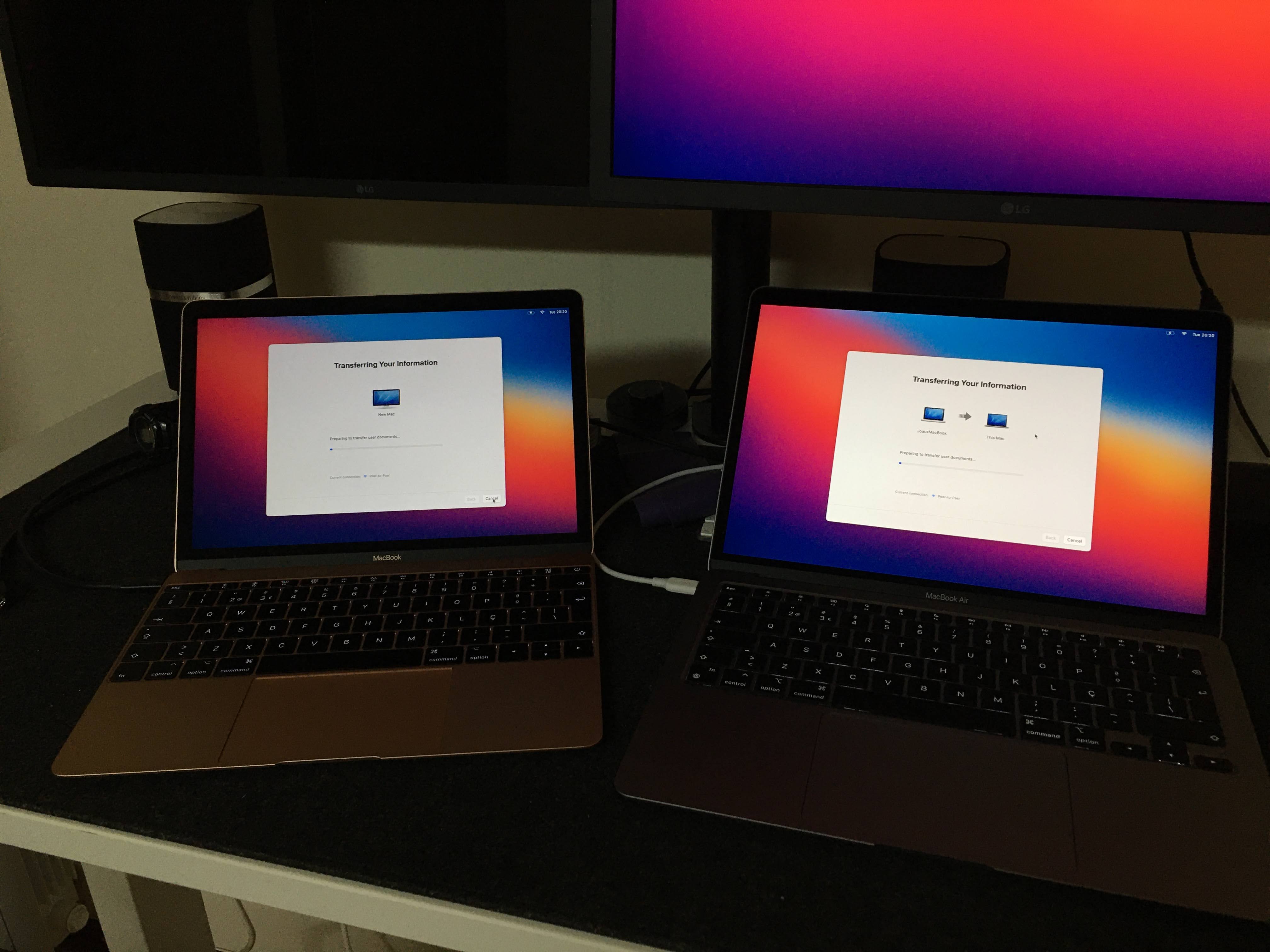
Out with the old, in with the new. Migrating MacBook 12 to a brand new 13'' Macbook Air M1
The MacBook Air M1 is incredible value
This is the best value in any laptop on the market today, bar none. When you factor the quality of the screen, the overall build quality, the battery life, the performance of the M1 chips, the quality of the speakers, the low weight… It is really no contest. Similarly-specced machines exist in the Windows world, but not for the price of the MacBook Air with the M1 processor. For that price you will have compromises: plastic build, nasty speakers, noisy fans are just a few. Apart from the 720p webcam, with its nasty grain in low light, nothing in this laptop feels cheap, although you can get the base model for around 1000€ here in Portugal.
Air or Pro?
Between the 13’’ Air and the Pro, I ended up going for the Air, and I am glad I did. It can handle everything I throw at it in absolute silence. There is another MacBook Pro 13’’ M1 in the family, and I never heard the sound of that computer’s fan, even during Final Cut Pro renders at 4k 60fps. Sure, the larger battery, the better microphones and the slightly higher 500 nits of brightness of the monitor (vs 400 on the Air) make a difference, but not enough to justify the extra cost. The price difference allows for a spec bump (more SSD storage or RAM), and the absence of the TouchBar is a great benefit for developers such as myself.
2022 - MacBook Pro 14’’ M1 Pro - The return of the Pro
The purchase of a MacBook Pro around 2008 was often seen as a worthwhile investment, since the unique combination of software and hardware enabled the machine to stay relevant for a long time, from a performance and design standpoint. They were seen in certain circles as lasting longer, being faster at very specific tasks, and providing an overall less buggy than Windows laptops.
As Intel failed on its promises of delivering increasingly efficient CPUs, there was a long time during which MacBook Pros went from being clearly differentiated from their consumer-level counterparts to little more than a different moniker targeted at “Prosumers”. The price tag remained high, but felt more like Apple charging its “Apple Tax” on the MacBook Pro brand than actual value. A Dual Core 13’’ Core i7 MacBook Pro in 2015 for more than 2000€9, or even worse, the dual-core, dual-Thunderbolt port MacBook Pros of 2017 for 1800€10? No way these could be considered true “Pro” machines, with many people I know delaying an upgrade until something came along that justified paying “Pro” money.
That something came along in 2021, with the arrival of the M1 Pro 14’’ and 16’’ MacBook Pros.
Design
The design of these machines is clearly different than the 13’’ M1 MacBook Pro, with more squared off corners reminiscent of the A1211 and A1212 MacBook Pros from 2006. They are built like tools: heavier and solid-feeling. The bottom rubber feet are larger in diameter and seem more solidly stuck to the bottom of the machine. They are slightly thicker too, firmly anchoring the machine to whatever surface it is placed on. There are two Thunderbolt ports on one side, each with the ability to drive its own display up to 6k, and another one on the right. If you opt for the M1 Mac version you can use all 3 to drive their own external display, up to 6k. There is also an HDMI port on the right side, adding to the flexibility of connections in this machine.
On these machines, the intake air vents on the sides of the bottom case are larger to allow the machine to draw in more air. The speakers remain excellent for the size of the machine, with the 14’’ even sounding bassy.
Gone is the TouchBar (good riddance), replaced with a row of full-size physical F-keys. The keyboard area is anodized in a much darker shade of gray, a new design cue for an Apple laptop.
Oh, and the Apple logo on the back of the lid is larger now, bringing it closer to the size of the illuminated logo on the MacBook Pro’s of old.
Display
Perhaps the greatest improvement versus the older machines is the display. It is now variable refresh rate (up to 120Hz), and the backlight is mini-LED. The mini LED technology makes blacks look darker and allows for higher sustained brightness as well, greatly increasing contrast ratios but without the downsides of OLED displays (such as low peak brightness and burn-in).
It has been enlarged without increasing the footprint of the machine thanks to much thinner bezels, and at the top lives the improved webcam (now 1080p, but still no Face ID hardware). This creates a “notch” similar to that in the iPhones, that in my opinion is not an issue. The mouse pointer jumps from one end to another automatically in daily use, and the notch ends up covering a part of the top menu bar that would normally not be used anyway. The display’s quality is amazing, and improves the cost/benefit ratio of the machine, making it hard to find a display of this quality at this price point.
Footnotes
-
To understand the importance of memory protection, one only has to look at the seriousness of the Spectre and Meltdown vulnerabilities, which can be weaponised by malicious processes to access data from other processes running on the same machine. They break memory protection, allowing, for example, a malicious process to read your banking passwords from the RAM segment allocated by your browser process). Spectre and Meltdown are especially bad because they are hardware-based vulnerabilities. This means that they are part of most Intel and AMD processors’ physical architecture and thus, cannot be patched with a software updated. Only by buying a new computer with a more modern CPU will the problem be solved. ↩
-
“Alfa Romeo GT Junior” by grassrootsgroundswell on Flickr Link ↩
-
“Kernel Panics in New MacBook Pro 16” — Solution is Here” Link ↩
-
“Use the LG UltraFine 5K Display with your Mac or iPad” Link ↩
-
“Introducing M1 Pro and M1 Max: the most powerful chips Apple has ever built” Link ↩
-
“Apple MacBook Pro 13-Inch “Core i7” 3.1 Early 2015 Specs” Link ↩
-
“Apple MacBook Pro 13-Inch “Core i7” 2.5 Mid-2017 Specs” Link ↩
Comments
Post comment