 The caffeinated engineer
CSS3 Exercises
- Online newspaper design
- No FlexBox / Grid Design
- Blocks
- Solutions for these exercises
- Acknowledgement
Online newspaper design
- Unzip the following file into some folder: news.zip.
- You should have now 4 files: index.html (the main page of an online newspaper), item.html (a page representing a single article with comments), register.html and login.html (pages for users to register and login).
- Analyze the structure of these files.
- As you might have noticed, all pages reference 5 css files: style.css (styling the main components), layout.css (positioning the main components), responsive.css (making the page responsive), comments.css (design for the comments section) and forms.css (design for the login and register forms).
- Without changing the HTML files, try recreating a design by following these 5 steps:
Main style
We will start by designing the main components of the main page without worrying about the positioning of any elements (style.css). The final result should be this.
Some helper values:
- Main colors used: #2A2F33, #046DD5 and #F4655F.
- Section colors: #E1493E, #8ABA56, #5B4282, #FF8932, #19B6E9 and #E84C8B.
- Fonts used: Verdana and Georgia.
- Most paddings and margins are 1em.
Tip: You may have noticed that the nav section contains an input and a label. These are just to be used in exercise 1.3 You can start by hiding them using CSS for now.
Positioning
Then we will position the elements in their proper places (layout.css). The final result should be this.
Some helper values:
- The background color is #EDEFF0.
- The width of the page is 60em.
- The sidebar occupies 1⁄5 of the total width.
Tip: Use a flexbox for the menu and a grid to position the elements in the page.
Responsive Design
We will now make the design responsive by establishing two break points (responsive.css):
- When the width of the window reaches 60em, the sidebar should disappear and the page should occupy the full width (100%) of the window. The final result should be this.
- When the width of the window reaches 30em, the menu should collapse into a pull-down menu, the subtitle should not be shown and each news item title should be moved to above the item image. The final result should be this.
Some helper values:
- Characters for the hamburger menu:
\2630(☰) and\2715(✕).
Tip: Start by making the menu without any animations (using display to hide and show the menu items). After that, try using transitions to change the height of each menu item instead.
Comments Section
Add CSS rules (comments.css) to create the design for the comment section that can be seen in the item.html page. The final result should be this.
Some helper values:
Quote character for each comment: \201C (“).
Forms Design
Add CSS rules (forms.css) to create the design for the register and login forms that can be seen in the register.html and login.html pages. The final result should be this .
Make sure that in smaller screens, the form fills the content area like this .
No FlexBox / Grid Design
Without using the flexbox and grid CSS layouts, try to recreate some designs.
- Copy the following HTML code: news.html into a new .html file.
- Open it and observe its structure.
- As you might have noticed, this document references a, not yet created, file named style.css as its style sheet. Create that file and modify it so that the page appearance becomes as similar to the following designs as possible: style 1 , style 2 and style 3
- Style 2 uses the following image:

Extra: Now try the same exercises, this time using flexbox and grid layouts.
Blocks
- Unzip the following file into some folder: blocks.zip
- Create a file called style.css and try recreating each one of the four following designs using Flexbox and Grid layouts:
Blocks Exercise - 1
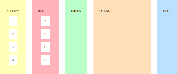
- Use a flexbox layout for this one.
- Orange block uses the remaining space.
Colors used: #FDFFAC, #E9A1AC, #AEFFBD, #F0D4AA and #A6D1F5.
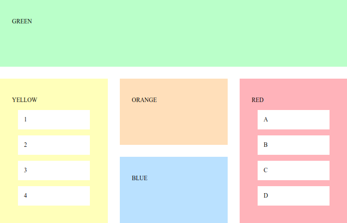
Blocks Exercise - 2
Blocks Exercise - 3
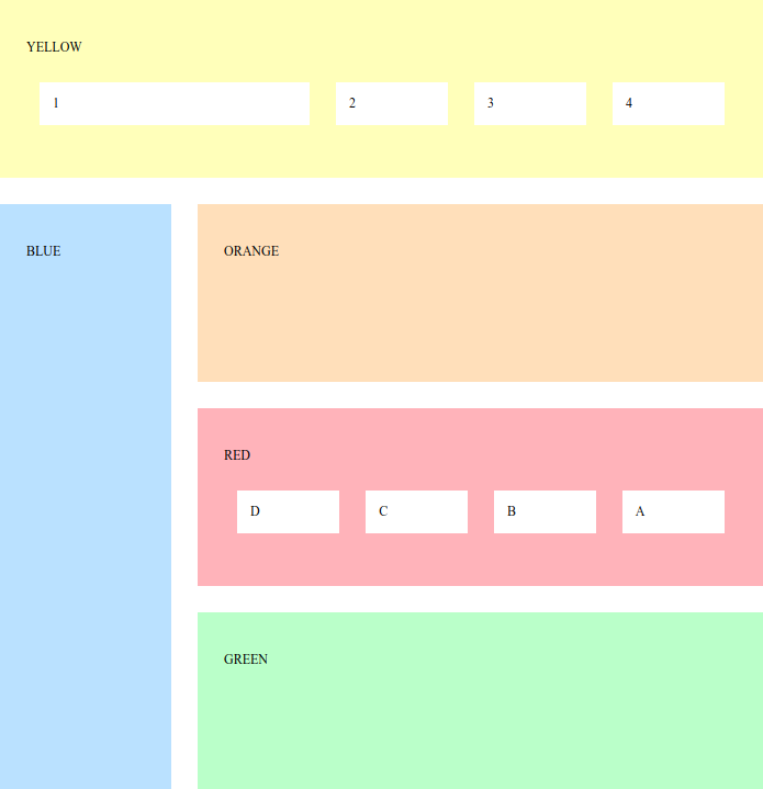
- First item in yellow block is three times the size of the others.
- Items in red block are reversed.
- Left column has 1⁄4 of the total width.
Blocks Exercise - 4
- Green and orange blocks have half the height of the red and yellow ones.
Solutions for these exercises
Acknowledgement
Exercises by André Restivo. Originals available here.